Graphics Communicate, Too
Last week in Nebraska, another candidate threw his hat into the race for governor, joining Lynne Walz in trying to unseat Gov. Jim Pillen.
Former State Sen. Brett Lindstrom is taking the independent route, which means before Nebraskans can even decide whether to vote for him, he first has to qualify for the ballot. That requires collecting at least 4,000 valid signatures, including 750 from each of Nebraska's three congressional districts, by 5 p.m. on August 3. That's just 14 days away.
Anyone entering a statewide race this late already has an enormous communications challenge.
Unfortunately, the campaign made it just a little harder.
The initial campaign graphic featured a stylized outline of Nebraska...except it accidentally lopped off southeast Nebraska.
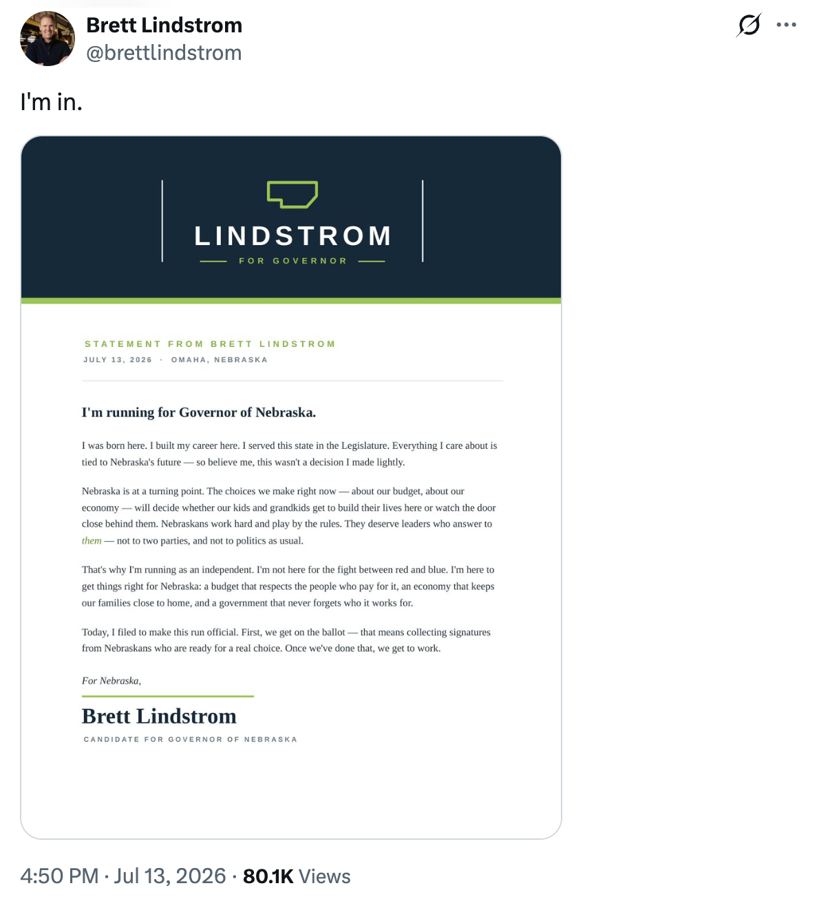
And the lopsided graphic started going viral.
We checked in with creative director Drew Davies of Oxide for his take.
"As a design decision, this one is particularly vexing. On the one hand, it feels like it could be some kind of unchecked AI design error, in which case it's an embarrassing mistake. On the other hand, if it's intentional, then it's a baffling decision to visually amputate the most populous section of the state. In any case, leaving the post with the mystery logo live on his social channels only adds fuel to the distraction fire, rather than focusing people on the more important fact that he's running for Governor.”
Davies nails the larger lesson.
This is a distraction.
Lindstrom needs voters thinking about his record, his priorities, and why he believes Nebraska needs a different direction. Instead, people were asking one question:
"Where did southeast Nebraska go?"
The campaign quickly corrected the logo. Problem solved?
Not quite.
The campaign's new X banner now displays the corrected Nebraska outline, but the pinned campaign announcement still carries the original letterhead. Presumably, they decided the engagement on the announcement post was worth preserving.
So now both versions live side by side.
Instead of studying the candidate, we're studying the graphic wondering why Nebraska suddenly annexed part of South Dakota, borrowed a little Iowa, and misplaced an entire corner of the state.
That's how quickly communications can drift off message. It all matters.
The words, the ideas, the tone, the design, the channels, the details, and the symbols matter. When they reinforce one another, they strengthen the story. When they don't, they become the story.
Prologue
I really don't enjoy piling on a brand-new campaign because every organization or announcement can have launch-day hiccups. But communications windows are unforgiving.
As I wrote this, the campaign website still greeted visitors with a "Coming Soon" message, even though there are only 14 days left to gather ballot signatures before the August 3 filing deadline (with the website sharing no information on how or where to sign).
Campaigns move fast. So do first impressions.